
 Which of these to choose. I love the bottom one as it's sort of lived in and interesting but then I keep going back to the top one and I am drawn to those chairs that stand out like jewels in an otherwise stark room.
Still undecided!
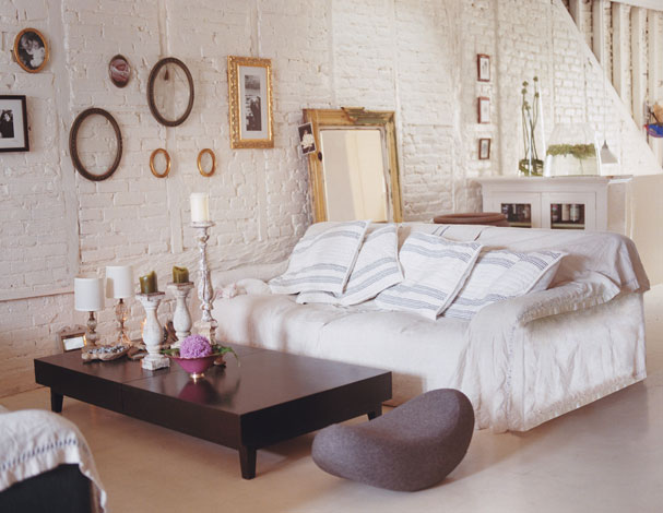
Bottom Picture via Domino Magazine
27 comments:
wish i lived there. =(
check out my blog!
The bottom is much more comfy-cozy, but the top one is way more interesting to me. Totally my style. :)
Mine is definitely the bottom one...I have very much the same candlestick collection in my living room and totally adore that mirror against the wall
Thanks...this was lovely
Chamara
nice to come across your blog. Thanks...
the top one looks cozy, in the background I see a sofa, and the space is more interesting... the bottom one looks so much like what many friends already have , shabby chic, I would choose the dining room/ living room top photo.
I really like the top room, but I am a sucker for contemporary designs. Cool blog!
literallyeverythingblog.com
......you are so right........and.......what is the most important thing?
Hi,
Well done for another accolade. You are a blog of note.
I love the arch and the curved chairs in the first photo. It would been arched windows to complete the curviness.
Regards,
Coral
I love them both too, but I'd choose the top one! Its more fun =)
Love second design.
You could just eat those chairs - they are like lemondrops.
Gd day!
We've been reading yr blog for awhile and we just wanna say that we really enjoy reading the stuff you put up!
Cheers
wow...
it looks like my home...
(:
Definitely the bottom photo! Even with the white walls, which normally would feel cold, there is a sense of warmth and an invitation to sit down feel to the room.
Dearest Di,
Thanks SO much for stopping by, I really appreciate your comments. Do stop back in soon, theres lots more to come! :)
both places are interesting in their own right but neither of them do justice to white
your blog on the other hand is a different kettle of fish
The top one has my vote!
I liked the white brick walls in one off the pictures. Just the first thougt that popped up in my mind. The furniture ? well...it looked ok.
i like the top one better. it looks spacey.
Posted by Chris Bassoo
I just wanted to pass on my congrats for your blog of note...great blog...I am glad I found it....I love the top design...thanks Christopher Bassoo
Chris Bassoo, Toronto, Canada
The top is like eye candy; an artistic materpiece. However the bottom one is warm amd chic; has life to it. While both are beautiful, the bottom one has me begging to be in it. :)
I love the white painted brick and the simplicity of the other pieces in the room. Nice blog -- I especially like some of the art.
Beautiful room. A learner in Architecture and Design. Welcome to my blogger..:)
I like the white one the best!
I love the arch in the top photo, not sure about the chairs doesn't seem right in such a serene room (top one for me, minus the chairs).
I like the top one. It's always good to be on top! Congrats on your blog of note.
I would choose the top room--it looks like there is a fireplace back there, making it a warm cozy place to sit, and all the extra space. the bottom room looks like every apt in brooklyn NY circa 1995.
Post a Comment